Solved by Flexbox
Cleaner, hack-free CSS
Introduction
CSS has been lacking proper layout mechanisms for far too long. Transitions, animations, filters, all of these are great and useful additions to the language, but they don't address the major problems that Web developers have been complaining about for what seems like an eternity.
Finally, thanks to Flexbox, we have a solution.
This site is not another CSS framework. Instead, its purpose is to showcase problems once hard or impossible to solve with CSS alone, now made trivially easy with Flexbox. And with the recent release of Internet Explorer 11 and Safari 6.1, the latest Flexbox spec is now supported in every modern browser.
Check out the demos below. View the styles in the Web inspector or dive into the source to see just how easy CSS layout will become once Flexbox becomes mainstream.
Showcase
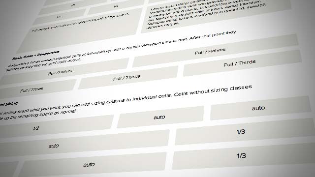
Better, Simpler Grids
Flexbox gives us most of the features we want from a grid system out of the box. And sizing and alignment are just one or two properties away.
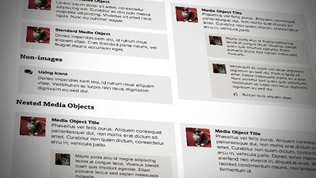
The Media Object
Create media objects with fixed or varying figure sizes without worrying about overflow, clearfixing, or block formatting context hacks.

Input Add-ons
Creating full-width, fluid input/button pairs has been impossible for most of the history of CSS. With Flexbox it couldn't be easier.
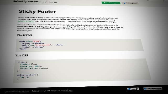
Sticky Footer
Getting your footer to stick to the bottom of sparsely contented pages has always been tricky. And if the footer's height is unknown, it's basically impossible. Not so anymore.
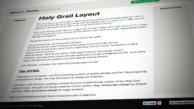
Holy Grail Layout
This classic problem has been challenging CSS hackers for years, yet none of the historical solutions have fully solved it. With Flexbox, it's finally possible.
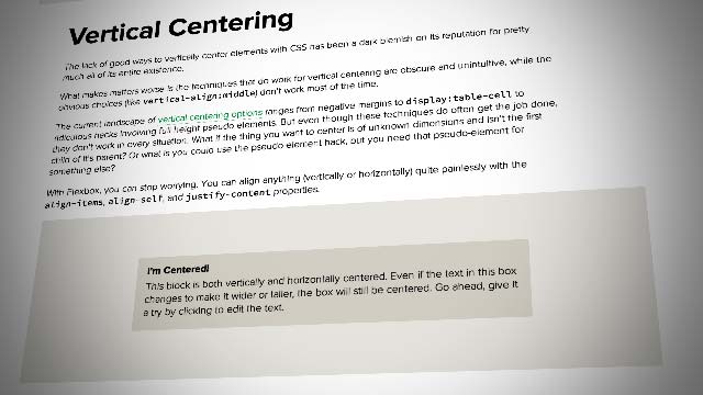
Vertical Centering
A lack of proper vertical centering has been the butt of almost every CSS joke ever told. While it's technically always been mostly possible, it's never been very intuitive — until now.
Browser Support
- Chrome21+
- Opera12.1+
- Firefox22+
- Safari6.1+
- IE11+
Caveats and Known Issues
- IE 10 has Flexbox support but for a draft version of the current spec: (
display:flexbox). - Safari 6 and earlier support the original Flexbox syntax, which is now obsolete: (
display:box). - Firefox 27 and earlier do not support multi-line flexboxes. See this bug for more details.
- For a full browser support comparison, check out caniuse.com/flexbox
No comments:
Post a Comment